responsive web design
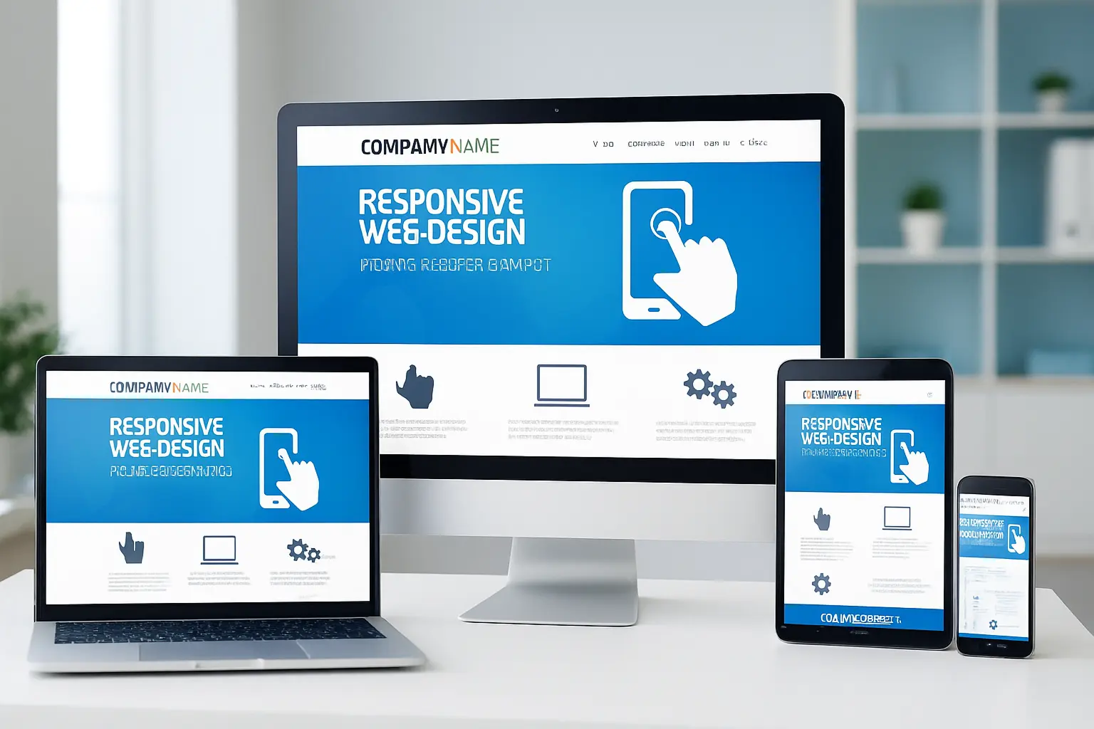
What is Responsive Web Design?
Responsive web design (RWD) is an approach to creating websites that automatically adapt to all devices and screen sizes — from mobile phones and tablets, to laptops and large monitors. The goal of a responsive website is for the content to always be viewed, functional and aesthetically appealing, regardless of device resolution or orientation.
A well-implemented responsive web design brings numerous advantages, such as:
- adapting to different resolutions and layouts of elements
- The use of flexible networks (fluid grids) and responsive components
- Optimized images and graphics for faster loading
- Better user experience (UX) and lower bounce rate
- SEO benefits, because Google favors mobile-friendly sites
Why is responsive web design important for your business?
Today, most users search the Internet via mobile phones. According to research from 2025, as many as 68% of online purchases worldwide will be made via smartphones. This means that if your site is not responsive and not adapted to mobile devices, you are losing a large number of potential customers.
Responsive web design brings numerous advantages that directly affect the success of your business:
- One site for all devices - no need for separate desktop and mobile versions.
- Better user experience (UX) - visitors stay on the site longer and find the information they are looking for more easily.
- SEO advantage - Google favors mobile-friendly websites, which means better rankings in search results.
- Higher conversion and customer trust - a professionally designed and technically optimized site increases the likelihood that a visitor will become a customer.